Dosenfisch – Branding concept for canned fish
Many designs of canned fish in Germany feel outdated. Canned (dead) fish in general is not a very appealing product. A statistic showed that canned fish is especially consumed by older people, therefore it might be a good idea to initiate a new design for younger consumers in the market. The strategy is to close the gap with a fun illustration approach.
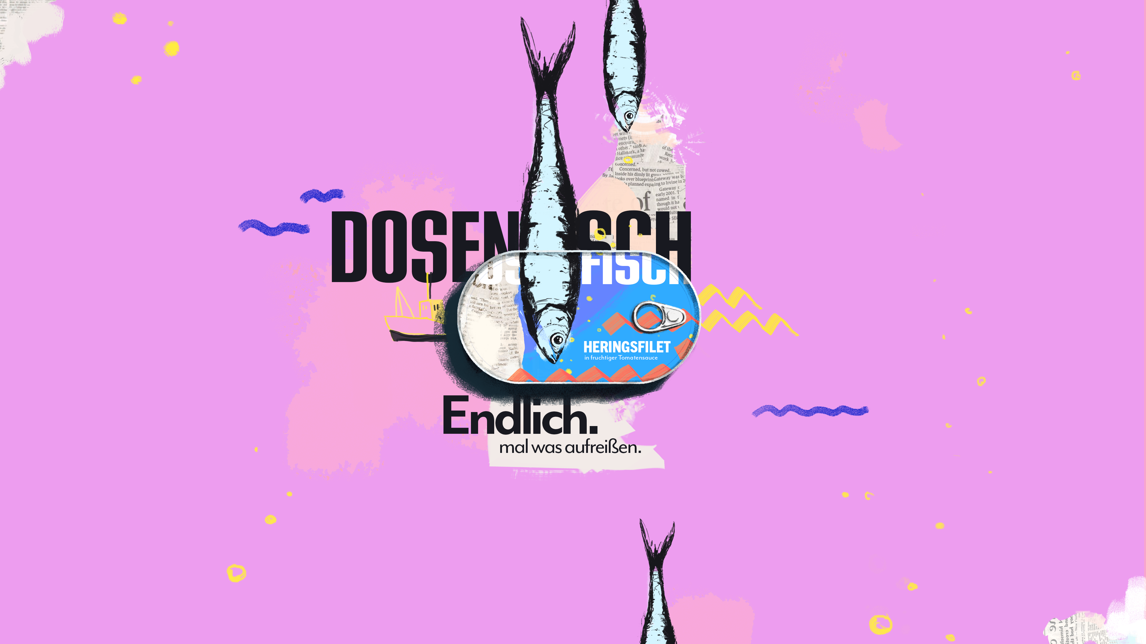
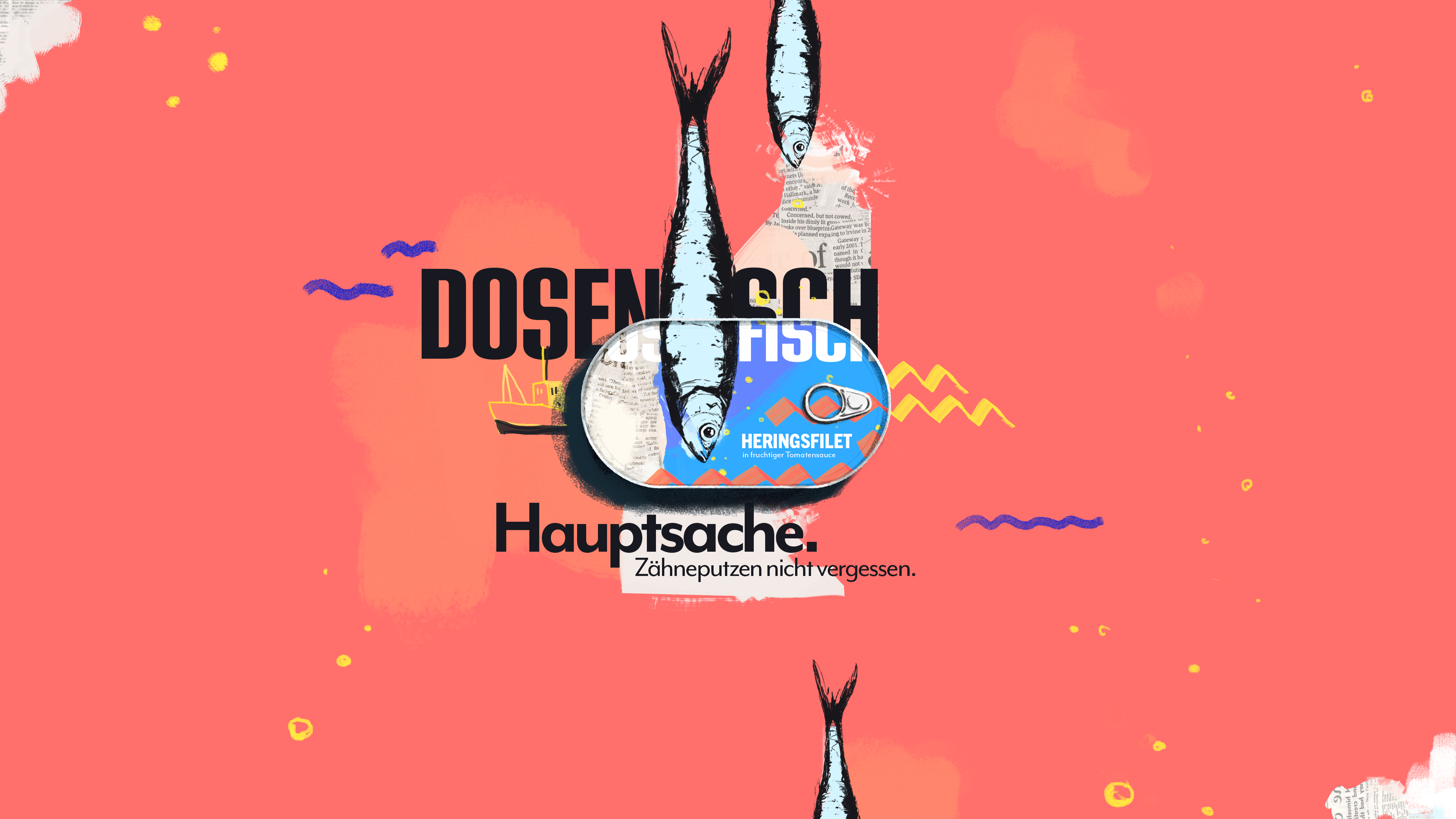
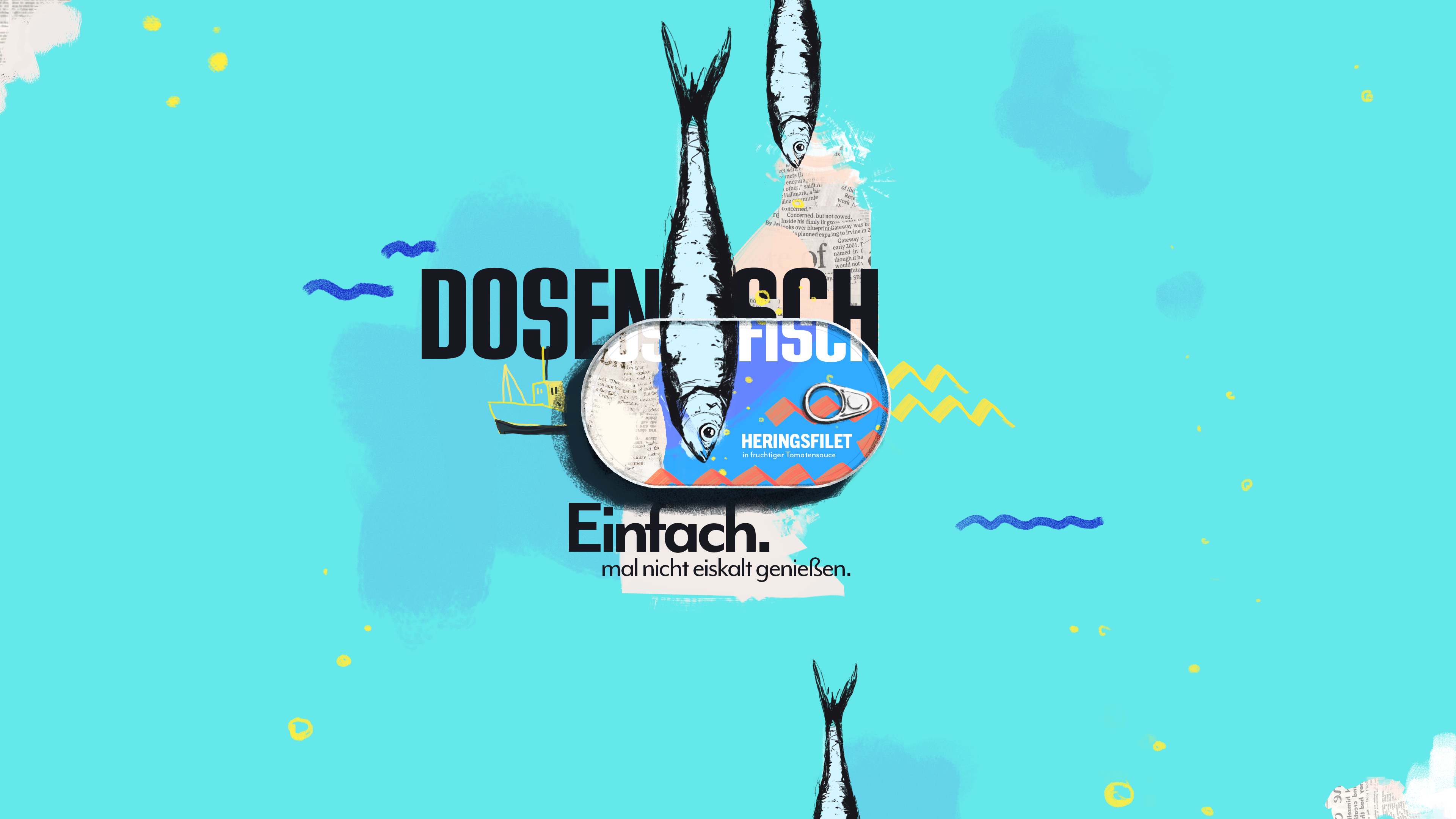
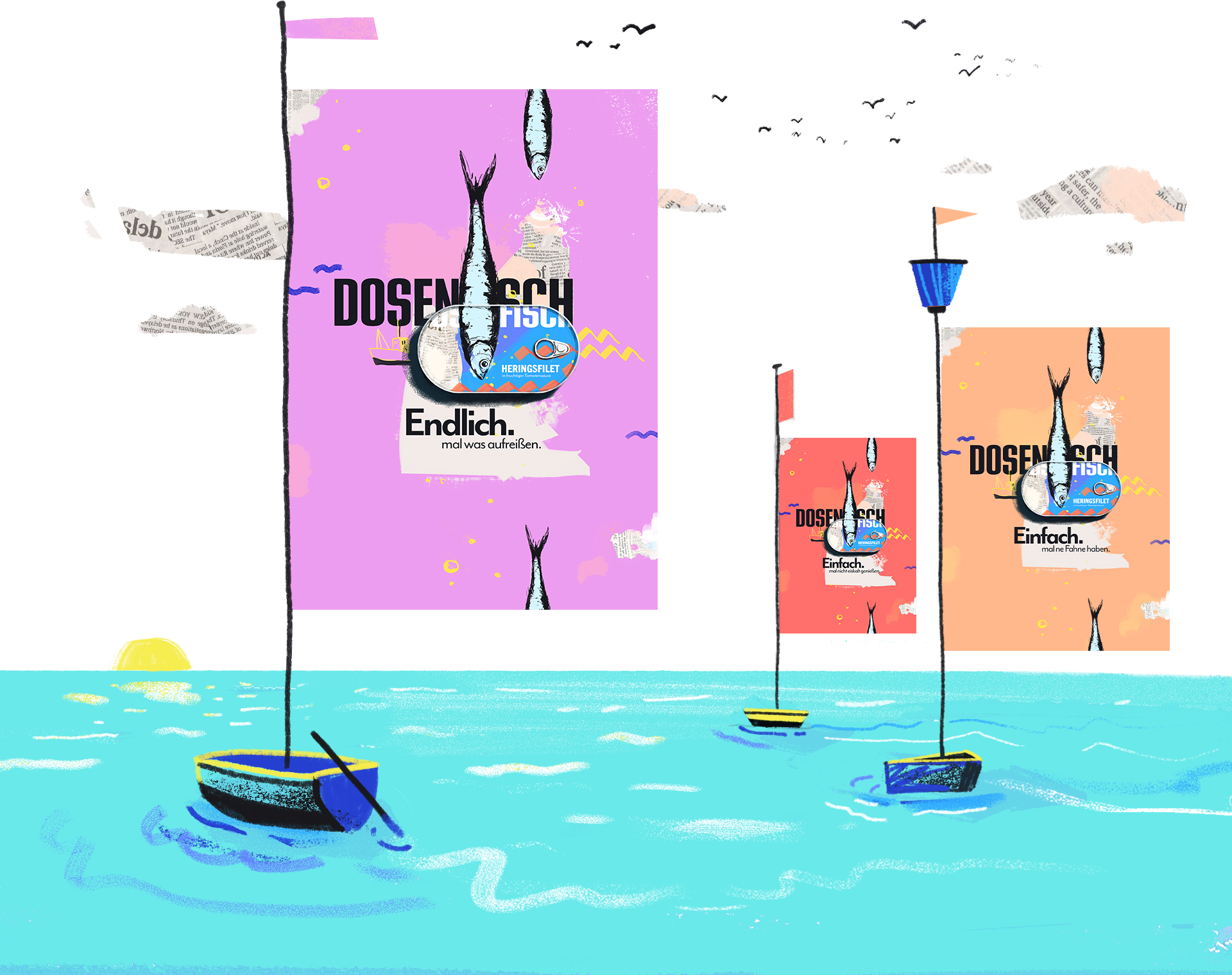
Campaign concept
The visuals are combined with self ironic claims. Thus turning the weaknesses of canned fish, e.g. the smell of the fish or the can itself, into something positive.
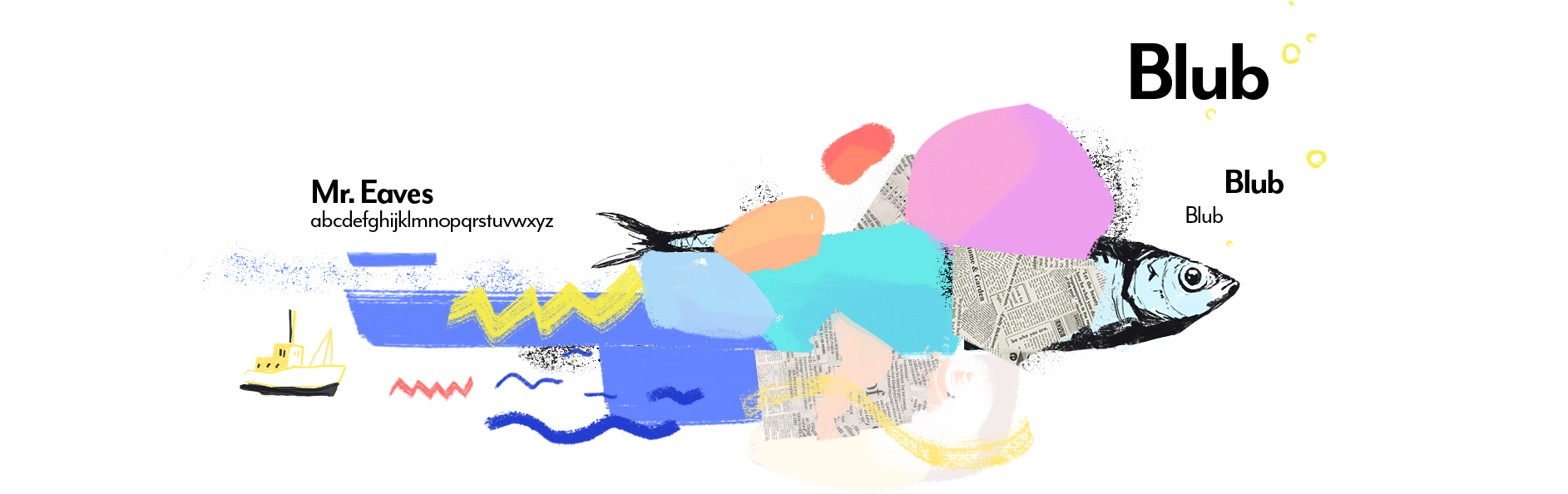
Visual toolbox
Inspired by Portuguese packaging design of canned fish, this project aims to capture that positive and sunny vibe. Combining vibrating colors and hand-painted textures with illustration to produce a pleasant look. In addition, weaving in pieces of old newspaper as it was used back in the days on marketplaces to wrap the fish – this shall give it some simpleness and a lighter feeling.